Since their conception, images have become increasingly integral to design. In the internet age, we are offered a galaxy of options when it comes to imagery for our designs – but how should we go about selecting them?
In this guide, we look at the process of finding the right images for a design, from basic best practices to some finer points that are essential to bear in mind:
1. Say yes to high res!
It is absolutely vital to source high resolution images for the purposes of print design, and only slightly less important when designing for the web. If you aren’t using a dedicated photographer or subscribing to an image bank which you can trust to deliver high res shots, be very wary of resolution when sourcing images from the internet. In general, you should aim for 300 dpi (dots per inch) in a JPG, TPI or EPS format.
2. Don’t be ‘stocky’
Been on a corporate website recently? Did you come across a very familiar looking photo of two business people shaking hands? There is a good chance that the web designer has used a stock image, which is sometimes referred to as being ‘stocky’. Stock images can be more budget friendly, but they might result in your product or service appearing generic or samey. Make use of original photography when you can, and if using image banks, seek unique looking imagery if possible.
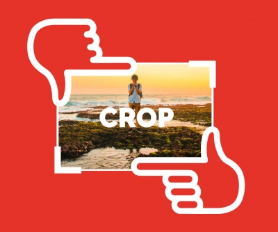
3. Give yourself the tool to make an impression
If you plan on adding effects to an image, leave yourself as much of a ‘blank canvas’ as you can. Quite often, stocky images do work well - when they have been manipulated using an editing tool such as Photoshop to offer a unique concept through delicate cropping and colouring effects. You shouldn’t be afraid of making your design as memorable as possible with imagery which has been adapted to suit your objectives.
4. Be mindful of branding
Your brand guidelines, and the brand values which inform them, will come into play when selecting images for your design. Consistency is key, and the type of images you select should not be out of line with the look of your other marketing output. If you are starting from scratch, ask yourself what your product or service stands for, and how it wishes to be seen. It isn’t just the tone and colour which are important – sit back and take in the overall feel of your image. If it includes people or objects, do they represent your brand faithfully?
5. Choose images which communicate
Rather than simply presenting images as part of a design and hoping that they strike the right tone, you should consider if images have the ability to communicate – both to other elements in the design, and to the audience. Ask yourself if the image is conveying the message you want it to about your product or service. Is the message made self-explanatory by the image, or is some thought required to make sense of how the image relates to your product or service? There is nothing wrong with challenging the viewer to think deeply, but for the purposes of brand design (rather than artistic design), quite often the saying ‘less is more’ applies.
So that’s our quick-fire guide to image selection in design. It is important to take your time and capture the essence of your brand in your imagery. You might find that once you have defined clear parameters for the imagery you want to use, your brand guidelines will make selection a lot simpler going forward.
Need advice on the right kind of imagery for your brand? Talk to the experts at Brand51 on 0117 261 5151.
Welcome to Brand51 Insights where we share our thoughts and useful tips to help you improve your company branding...