Colour affects the way we think. Don’t take our word for it – there have been plenty of academic studies over the years which have confirmed something we already suspected; that the psychology of colour can influence our emotions and behaviour.
When considering design, it naturally follows that a great deal of care must be taken when selecting the colours to use in the branding of a product or service. In this guide, we take you through some key considerations pertaining to choosing colours, and break down the psychology associated with a number of colour options.
Know your audience
As with many elements of branding and marketing, knowing your audience inside out is important when selecting colours. Research suggests there is a difference between the ways in which the two genders interpret colours. While colour preference can certainly be subjective, as a general rule, it was found that men tend to favour bold colours, while women prefer softer colours. Orange was found to be the colour disliked the most by both men and woman, and blue was well received by both. While these findings alone shouldn’t form the basis of your selection, you should not disregard them, either.
Know your product or service
Just as important as knowing your target audience, is having a deep comprehension of what your product or service stands for. This understanding is an extension of your brand values, and if you haven’t set out your brand values yet, this Brand51 blog might help. Take the ‘Yorkie’ chocolate bar, for instance. This is a snack which markets itself on being bigger and chunkier than other chocolate bars, so it is logical that the combination of colours used in the design – in this case, blue, yellow and red – should be unashamedly bold and loud.
Consistency is key
If you are an organisation which liberally sprays around different colours when branding various services, you might be missing a trick. That’s because often the colours used in design can only strengthen a single brand identity if they are kept consistent. If you asked somebody to tell you the colours they associate most with the following brands; KFC, Starbucks and Pepsi – it is likely that they would reply “red, green and blue”. It is thanks to the consistency of colours used in the design of these brands, that they are so instantly recognisable.
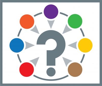
A Psychological Guide to Colours
Years of brand design have taught us that certain colours promote specific emotions in the beholder. These emotions can be instructive when choosing colours for the branding design of our products and services, so let’s go through them, colour by colour:
Red
Red is a strong colour commonly associated with passion, as well as love, warmth and excitement. But red also has another side. It can signify danger, and even anger, in a different context.
Orange
Orange is all about enthusiasm, warmth and energy. It can also be associated with citrus fruits, and the feeling of refreshment. It is a loud colour which does a good job of grabbing attention, so make sure you use it wisely.
Pink
The colour of romance, love and commonly categorised as a feminine colour, pink can be associated with ideals we sometimes attribute to women; kindness and compassion. It can also produce feelings of calmness.
Black
In the fashion world, black garments are recognised as having a slimming effect. Elsewhere, the colour is undeniably linked with evil, mourning and death. But don’t let that discourage you from exploiting black’s positive connotations, such as elegance and power.
Yellow
If you are looking for a colour which makes your brand appear to be inviting and cheerful, yellow could be the solution. It is also a good attention grabber which can attract eyes, if this is one of your branding goals.
Blue
Reliable, non threatening and peaceful; it is easy to see why many corporations side with blue in their branding design. Blue offers the ability to transmit stability in branding design, but be wary of its flip sides – the feeling of being cold or distant.
Green
Green is inextricably linked to nature, as well as evolution and fertility. It has the ability to calm and sooth, as well as denote good health
White
White is seen as pure and clean, and there are parallels in our culture – it’s this symbolism which is the reason why brides traditionally wear a white wedding dress. But be careful of the countering connotations; blandness and coldness.
Purple
Want to add a royal feel to your design? It is said that we associate purple with royalty because of the heads of state who have worn purple-coloured garments down the years. It is also seen as dreamy and slightly mysterious.
When carefully selected, colour can be a crucial weapon in your design armoury – so make sure your selection process is in tune with your branding!
Is your brand design in need of a refresh? Call Brand51 today on 0117 261 5151.
Welcome to Brand51 Insights where we share our thoughts and useful tips to help you improve your company branding...